I love landing pages because they’re no nonsense and they work. Quality user experience (UX) has everything to do with that.
Unlike websites which offer multiple user journeys, landing pages have one dedicated purpose: to persuade users to take a single action.
“Buy now!”
“Subscribe today”
“Download our free guide”
“Join our mailing list”
“Sign up now”
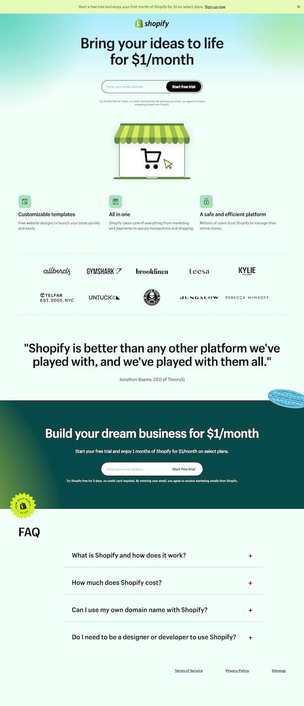
In this post we’ll take a look at Shopify’s landing page, one I believe is a pretty good example of landing page best practices.

Let’s break down the core UX elements that make it work:
Messaging
Landing pages become compelling when they tell a story about how your product or service benefits the user. Your messaging must revolve around this single, specific goal: telling the details of this story, and how it ends happily-ever-after.
This messaging includes a wide variety of content types, including headlines, descriptive body copy, and calls-to-actions. Shopify’s landing page unmistakably features a singular pitch: ecommerce for $1 per month.
You’ll see it repeated multiple times throughout the page, and all of the supporting copy strengthens this claim with added benefits.
The driver of all good landing pages is the headline — a catchy, clever, concise introduction that welcomes the user to the page and assures them they’re in the right place.

Buttons
Buttons are awesome because they have a specific advantage — every aspect of our lives includes buttons. From the coffeemaker at home to the radio in your car to the elevator at work. It’s an extremely recognizable tool that users can connect with.
Your landing page requires at least one prominent button that draws the user’s focus and helps them complete an action. It’s so simple yet so important. Place your buttons in prominent locations and be sure they are given proper size and positioning that fits their valuable function as the doer of the LP.
Shopify leads off with a powerful button that commands your attention. If you did nothing more than but look atop this page, you would know exactly its purpose and what you should do.
Forms
Forms are the often-feared place where we expect users to give away their personal information, including names, email addresses, locations, and even phone numbers. Forms are quite underrated in their design status as a user experience item.
There are many considerations your design team should know in developing your forms, from what information you’re asking for to how input errors are communicated, and how input fields are designed for ease of use on all formats from desktop to mobile screens.
Our Shopify example is good because it’s simple and it asks for probably the most non-threatening information a user is willing to give out: their email address. This may not be practical for every landing page, but I urge you to ask users for the bare minimum necessary. You can get their details later.
Visualizations
You can’t do it with words alone. There’s nothing more compelling than pictures, illustrations, and other eye candy that helps your page engage the user. You should plan for at least one main focal point, along with other design elements that create visual flow.
Shopify’s design is cool because it’s simple and on-brand. It gives the user an easy, uncomplicated feeling of how the user will find their ecommerce product. Additional props for the social proof section that includes logos of prominent business who use the product, plus a large testimonial.

Page Layout
Finally, content presentation is a major factor in a successful landing page’s user experience. It’s vital that you find an order of information that creates a journey for the user. Start with the important information first, and then establish a hierarchy of information that will engage and encourage the user to commit to your product or service.
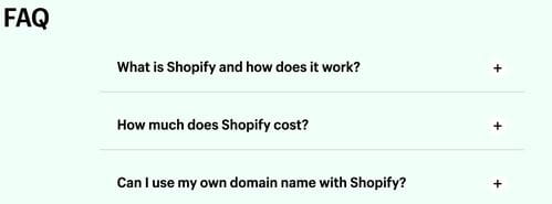
Shopify does this quite well. After the initial pitch, you are given 3 benefit statements, some social proof elements, a follow-up call-to-action that builds on the initial CTA, and finally an FAQ section that builds trust to users who may not quite be convinced yet. It’s a complete journey in my book, and it doesn’t overwhelm.

Summary
Creating a website landing page is an important and typically necessary step for promoting your product or service, especially when you are introducing customers to something new or important in your sales cycle.
As the Shopify example shows, focusing on the key elements of user experience can make a tremendous difference in how successfully you engage and entice your visitors.
