Website Experience Design
Baptist Cancer Center (BCC) features a network of specialized care centers as part of the Baptist Memorial group, one of the top health care institutions in the Mid-South. The health care provider is a unique mixture of some of the top cancer treatment practices plus localized care. Essentially “The Finest Care, Close to Home.”
Challenge
BCC came to us with the challenge of building a strong, impactful identity separate from the parent group of Baptist Memorial. Their existing website featured both outdated content and insufficient/broken technology. A new website would feature more than 200 pages with both static and dynamic content, and would allow patients to both find information on treatments and request an appointment.
Approach
As lead UX Designer, I took on both the strategy and execution of the UX tasks for this project. My lead designer would handle all UI decisions in close collaboration with me and the information and research I provided. As a note: it was decided we would be using low fidelity wireframes as part of the UI process, which I over-sought.
Client Goals, Objectives, and KPIs Workshop (Miro)
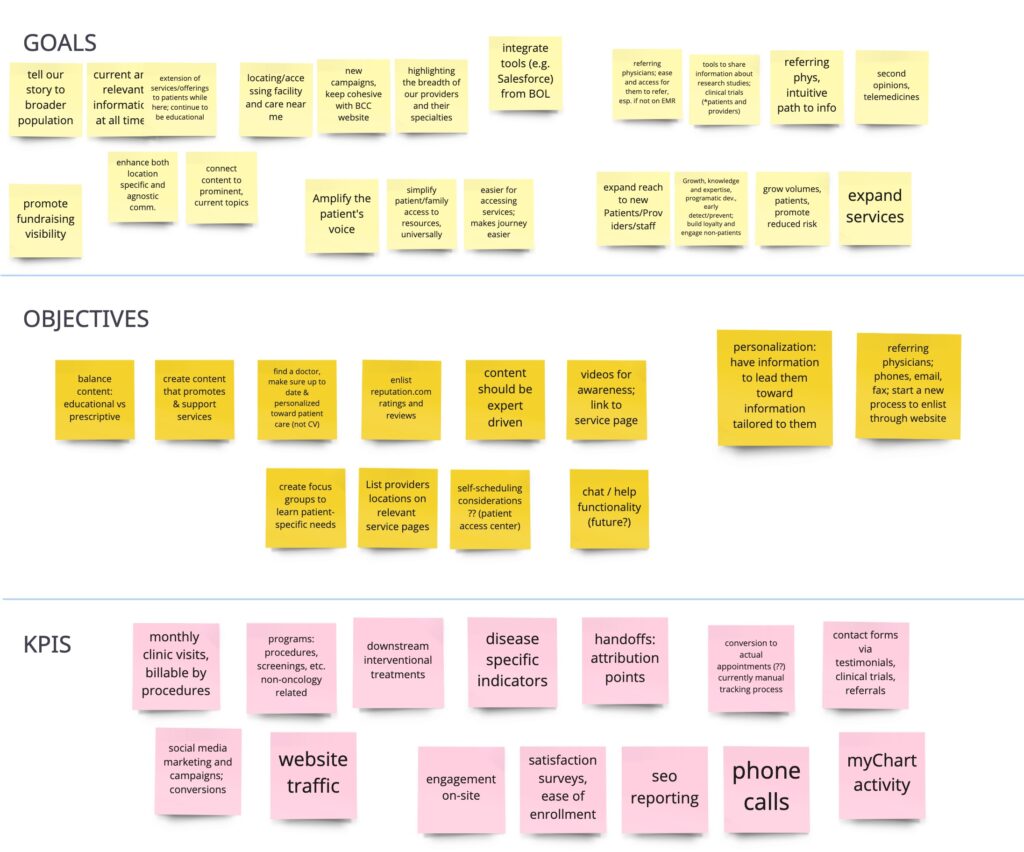
I began the UX engagement with a 2-day Client Discovery Workshop, which we adapted from in-person to online process due to COVID restrictions. I found Miro to be an excellent tool for dynamic activities such as this and was able to set up boards for six different workshops. Others included Persona development, and MOSCOW (“Must Have, Should Have, Could Have, Won’t Have.”)
Sitemap Diagram (Slickplan)
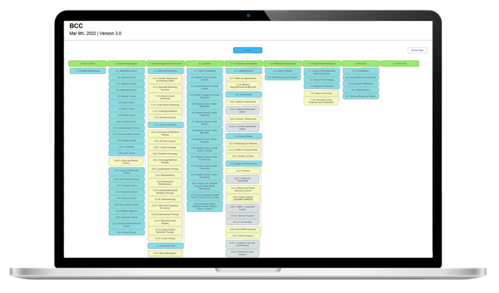
As an outcome of the client discovery process, and knowing their goals, objectives, and desired KPIs, plus the website features they prioritized, I was able to create content hierarchies and categorical groupings. By presenting this sitemap to the client I was able to explain the reasoning for my choices and was able to gain feedback that was essential for the project to move forward.
User Personas
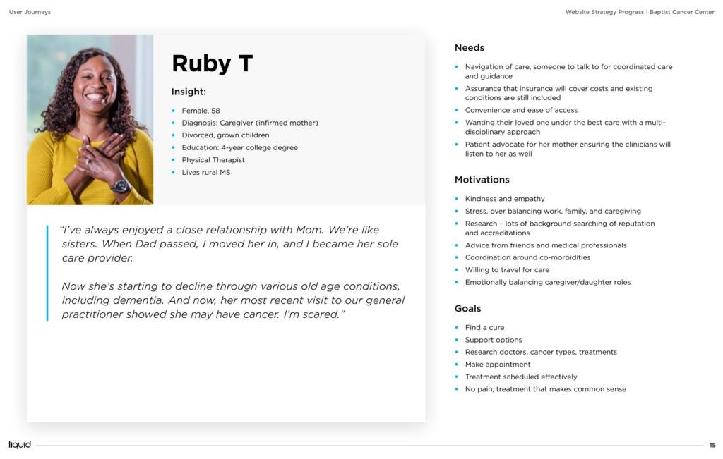
Creating user personas in collaboration with the client enabled us to accurately portray what we determined to be 5 major users of the website, plus two minor. These descriptions were invaluable to me when it came time to design the primary and secondary navigation, the user flow, and for justifying many of my content decisions.
User Flow Diagram
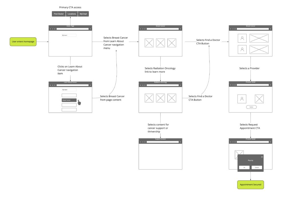
An important decision needed to be made with regard to the priority outcomes we anticipated our users seeking and the actions we could support to enable an easy user journey. This user flow diagram helped connect the dots between users seeking information and the ultimate step of contacting health care provider.
Content Workshop
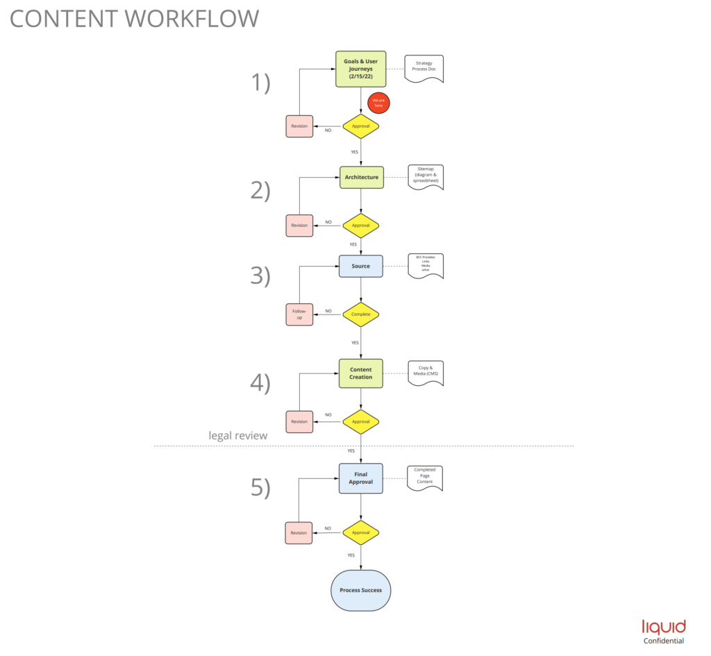
Depending on the client, content is authored in one of three ways, fully provided by client, source documentation provided by client and I would copy, rewrite, or a combination of the two. Regardless of the method it’s vital the client know the specific process for content integtration and especially their role in terms of feedback and approval. I created a 1-hour content workshop to walk through the necessary steps involved with this process.
Outcome
At the time of publishing this, the website is in the client’s hands for content integration. Prior to this step, I built out 24 sample pages in the back end of the Sitecore content management system (CMS). These pages represent the different types of templates I chose for the various website components my Art Director designed. The development of the website is on track for an early spring deployment.
UPDATE: website is now live, Take a Look
